tinytooltip.js - jQuery Plugin
Overview
It's a simple jQuery tooltip plugin extended from Twitter Bootstrap's tooltip and popover plugin that supports 12 positions, background color, font color, border color, videos, image map areas, image hotspots, menus and AJAX data loading with responsive behavior.
Data Attributes "data-"
You can use the HTML5 data- attributes (provided in the API reference) of any HTML element to set the different properties of tinytooltip.js.
<a href="#_"
    data-placement="top"
    data-title="sample tooltip text">
    link text
</a>
This plugin uses the HTML5 data-api that enables to maintain the validaity of HTML code elements w.r.t W3C validation standards.
jQuery API method
The tinytooltip plugin generates content and markup on demand, and by default places tooltips after their trigger element. Trigger the tooltip via JavaScript:
$("a").tinytooltip(); // code to initialize with defaults
$("a").tinytooltip({ textcolor : "#000000" }); // "textcolor" parameter with value "#000000"
$("a").tinytooltip({ textcolor : "#000000", placement : "right" }); // multiple parameters
API uses the default JSON based { key: value } comma-separated pairs of options to set the tinytooltip properties.
Integration
CSS
Include the tinytooltip.css inside the <head> tags as shown below:
<link href="css/tinytooltip.css" rel="stylesheet" />
JavaScript
Add the tinytooltip.min.js at the bottom of your HTML page just above the closing </body> tag.
<!-- jQuery first then tinytooltip.js -->
<script type="text/javascript" src="js/jquery-3.3.1.slim.min.js"></script>
<script type="text/javascript" src="js/tinytooltip.min.js"></script>
HTML
After you are done with including CSS and JavaScript files you can add the following HTML markup in your page body:
<a href="#_"
    data-placement="top"
    data-title="sample tooltip text">
    link text
</a>
Usage
When you are done with adding above HTML markup code, you can call the tinytooltip method over that tag:
$("a").tinytooltip();
You can insert the above code below the included tinytooltip.js script.
API Reference
Options
RESPONSIVE tooltips
Now responsive option can be used to enable the responsive behavior of tooltip.
Deprecated
Use data-placement="right auto" or your preferred placement (among 12 positions) along with auto to activate responsive behaviour of tooltip/popover.
Options can be passed via data attributes or JavaScript. For data attributes, append the option name to data-, as in data-backcolor="".
| Name | type | default | description |
|---|---|---|---|
| animation | boolean | true | apply a CSS fade transition to the tooltip |
| action | string | 'tooltip' | automaticlly chooses the template for tooltip/popover. You can specify the action - tooltip | popover. |
| placement | string | function | 'top' |
how to position the tooltip - top-left | top-right | left-top | right-top | top | left | right | bottom | left-bottom | right-bottom | bottom-left | bottom-right | auto. When "auto" is specified, it will dynamically reorient the tooltip. For example, if placement is "auto left", the tooltip will display to the left when possible, otherwise it will display right.
|
| responsive | boolean | true |
If responsive is true it will dynamically reorient the tooltip.
You don't need to use auto placement with this new responsive option.
|
| selector | string | false | If a selector is provided, tooltip objects will be delegated to the specified targets. |
| skin | string | 'default' | enables to specify the predefined color scheme skin name - PacificBlue | PersianRed | PersianRed |
| trigger | string | 'hover focus' | how tooltip is triggered - click | hover | focus | manual. You may pass multiple triggers; separate them with a space. |
| delay | number | object | 0 |
delay showing and hiding the tooltip (ms) - does not apply to manual trigger type If a number is supplied, delay is applied to both hide/show Object structure is: |
| title | string | function | '' | default title value if title attribute isn't present |
| content | string | function | '' | default content value if data-content attribute isn't present for action - 'popover' |
| html | boolean | false | Insert HTML into the tooltip. If false, jQuery's text method will be used to insert content into the DOM. Use text if you're worried about XSS attacks. |
| container | string | 'body' |
Appends the tooltip/popover to a specific element. Example: container: 'body'.
This option is particularly useful in that it allows you to position the tooltip/popover in the flow of the document near the triggering element -
which will prevent the tooltip/popover from floating away from the triggering element during a window resize.
|
| ajax | boolean | false | enables to use AJAX content loading feature of tinytoolip. |
| ajaxUrl | string | '' | here you can pass the URL to call the AJAX feature. |
| params | JSON | {} | enables to sepcify the key: value pairs of parameters for AJAX callback. |
| method | string | 'GET' | you can set the 'POST' | 'GET' method type to fetch or send the data using AJAX callback. |
| loading | string | 'loading...' | default text value that appears while fetching the data from AJAX callback. |
| error | string | 'error occurred' | default text value that appears if error occurs while executing the AJAX callback. |
| cache | boolean | true | enables/disables the caching of AJAX callback. |
| shadow | boolean | true | enables/disables the shadow effect. |
| opacity | number | 0.9 | enables to set the opacity of tooltip/popover. Value between 0 and 1. |
| borderRadius | number | 4 | sets the border radius of tooltip. |
| border | boolean | true | shows/hides the border around the tooltip. |
| padding | number | 8 | adds the padding between border and content of tooltip/popover. |
| minWidth | number | 0 | enables to set the minumum width for tooltip/popover. |
| maxWidth | number | 350 | enables to set the maximum width of tooltip/popover. |
| textalign | string | 'center' | specifies the text align for tooltip/popover content - left | right | center. |
| backcolor | string | '#000000' | Color name or Hex-code for setting the background color. |
| textcolor | string | '#ffffff' | Color name or Hex-code for setting the font color. |
| bordercolor | string | '#ffffff' | Color name or Hex-code for setting the border color. |
| titleBackcolor | string | '#f7f7f7' | Color name or Hex-code for setting the background color of popover titles. |
| titleBordercolor | string | '#ebebeb' | Color name or Hex-code for setting the border color of popover titles. |
| titleTextcolor | string | '#444444' | Color name or Hex-code for setting the font color of popover titles. |
| contentBackcolor | string | '#ffffff' | Color name or Hex-code for setting the background color of popover content area. |
| contentTextcolor | string | '#444444' | Color name or Hex-code for setting the font color of popover content. |
| menuLinkcolor | string | '#ffffff' | Color name or Hex-code for setting the font color of menu item links. |
| menuHoverLinkcolor | string | '#000000' | Color name or Hex-code for setting the mouse over font color of menu item links. |
| menuHoverBackcolor | string | '#ffffff' | Color name or Hex-code for setting the mouse over background color of menu item links. |
| menuItemDividercolor | string | '#ffffff' | Color name or Hex-code for setting the divider border color between menu item links. |
| arrowcolor | string | '#ffffff' | Color name or Hex-code for setting the arrow color of tooltip/popover. |
Data attributes for individual tooltips
Options for individual tooltips can alternatively be specified through the use of data attributes, as explained above.
Examples
Positions
| top-left | top | top-right |
| left-top | right-top | |
| left | right | |
| left-bottom | right-bottom | |
| bottom-left | bottom | bottom-right |
Usage
You can specify the different data-placement attribute values to set the tooltip positions around the target element.
HTML
<a href="#_"
      data-title="sample tooltip text here"
      data-placement="right">
      link text
</a>
JavaScript
<script type="text/javascript">
    // call plugin method using element selector
    // to attach the tooltip
    $("a").tinytooltip();
</script>
Color Presets
| backcolor | textcolor | bordercolor | preview |
|---|---|---|---|
| #0099cc | preview | ||
| #6633cc | preview | ||
| #990099 | preview | ||
| #0066cc | preview | ||
| #cc3333 | preview | ||
| #009900 | preview | ||
| #e06666 | preview | ||
| #ccffff | #333333 | #33ffff | preview |
| #ccccff | #333333 | preview | |
| #ffcccc | #333333 | preview | |
| #99ccff | #333333 | preview | |
| #ffcc99 | #333333 | #cc9999 | preview |
Usage
You can specify the different data-backcolor, data-textcolor and data-bordercolor attribute values to change the background, font and border color of tooltip wrapper.
HTML
<a href="#"
      data-backcolor="#ffcc99"
      data-textcolor="#333333"
      data-bordercolor="#cc9999"
      data-title="sample tooltip text"
      data-placement="right">
      target element
</a>
JavaScript
<script type="text/javascript">
    // call plugin method using element selector
    // to attach the tooltip
    $("a").tinytooltip();
</script>
Alternatively, you can also set the backcolor, textcolor and bordercolor options in the jQuery method:
<script type="text/javascript">
    $("a").tinytooltip({
        backcolor: "#ffcc99",
        textcolor: "#333333",
        bordercolor: '#cc9999'
    });
</script>
Skin Presets
| skin | preview |
|---|---|
| PacificBlue | preview |
| PurpleHeart | preview |
| DarkMagenta | preview |
| NavyBlue | preview |
| PersianRed | preview |
| IslamicGreen | preview |
| Roman | preview |
| LightCyan | preview |
| LavenderBlue | preview |
| Cosmos | preview |
| SkyBlue | preview |
| PeachOrange | preview |
Usage
You can specify the data-skin attribute value to change the background, font and border color of tooltip wrapper.
HTML
<a href="#"
      data-skin="PacificBlue"
      data-title="sample tooltip text"
      data-placement="right">
      target element
</a>
JavaScript
<script type="text/javascript">
    // call plugin method using element selector
    // to attach the tooltip
    $("a").tinytooltip();
</script>
Alternatively, you can also set the skin option in the jQuery method:
<script type="text/javascript">
    $("a").tinytooltip({
        skin: 'PacificBlue'
    });
</script>
Popovers
|
|
Usage
You can use the data-action="popover" in HTML code or action: 'popover' option in jQuery method to set the tinytooltip behaviour and style as popover.
HTML
<a href="#"
      data-skin="PacificBlue">
      target element
</a>
JavaScript
<script type="text/javascript">
    $("a").tinytooltip({
        html: true,
        action: 'popover',
        placement: 'right auto',
        trigger: 'hoverable',
        delay: { hide: 400 },
        textalign: 'left',
        title: 'Popover title',
        content: 'And here\'s some amazing content. It\'s very engaging. Right?'
    });
</script>
Image Map Areas
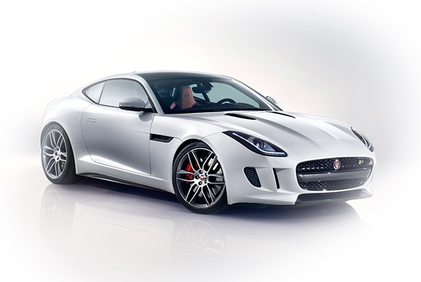
* mouse over the front tyre and headlight to see the preview.
Usage
You can use the following HTML code to create image map areas and attach them to tinytooltip using simple jQuery code.
HTML
<div class="row">
    <div class="col-sm-12" style="overflow-x: auto">
        <img usemap="#car-image-map" src="assets/images/jaguar-image-map-hotspots.jpg" />
        <map name="car-image-map" id="car-image-map">
            <area id="area1" shape="rect" coords="315, 185, 415, 225" href="#" alt="LED Headlights" />
            <area id="area2" shape="circle" coords="285, 255, 45" href="#" alt="Alloy Wheels" />
        </map>
    </div>
</div>
JavaScript
<script type="text/javascript">
    $("#car-image-map #area1").tinytooltip({
        html: true,
        trigger: 'hover',
        placement: "top auto",
        skin: 'PacificBlue',
        border: false,
        title: '<p class="light">LED headlights featuring LED \'J\' blade Daytime Running Lights.</p>'
    });
</script>
Image Hotspots
Usage
You can use the following HTML code to create responsive image hotspots and attach them to tinytooltip using simple jQuery code.
HTML
<div style="max-width: 600px; position: relative;">
    <img class="img-responsive" id="car-image-hotspots" src="assets/images/jaguar-image-map-hotspots.jpg" />
    <div id="hotspot1" class="hotspot" style="border: solid 10px #cc0000; border-radius: 100%; position: absolute; left: 46.2%; top: 60.5%"></div>
    <div id="hotspot2" class="hotspot" style="border: solid 10px #cc0000; border-radius: 100%; position: absolute; left: 60.5%; top: 49.8%"></div>
</div>
You can use hotspot CSS class for adding the blink effect to hotspot marks on image.
JavaScript
<script type="text/javascript">
    $("#hotspot1").tinytooltip({
        html: true,
        trigger: 'hover',
        placement: "top auto",
        skin: 'PersianRed',
        border: false,
        title: '<p class="light">LED headlights featuring LED \'J\' blade Daytime Running Lights.</p>'
    });
</script>
Image Templates
Usage
You can use the title option in jQuery method to set the tooltip image template or
content option to set the popover image template.
It renders the HTML template in tooltip/popover container.
Template
Following template can be used to create the image tooltip/popover using HTML code.
<p class="light">
    <img src="assets/images/eagle.jpg" class="image-left" />
    Lorem ipsum dolor sit amet, consectetur adipiscing elit.
    Donec elementum consectetur felis non viverra.
</p>
You can use the image-left and image-right CSS class for img tag to align the image in tooltip/popover content.
light or dark CSS class can be used with p tag in above image template to set the predefined dark/light
font and background of image template.
HTML
<a id="image-left-1" href="#">
      target element
</a>
JavaScript
<script type="text/javascript">
    $("#image-left-1").tinytooltip({
        textalign: 'left',
        trigger: 'hover',
        placement: "right auto",
        padding: 5,
        html: true,
        skin: 'PacificBlue',
        border: false,
        title:
            '<p class="light"><img src="assets/images/eagle.jpg" class="image-left" /> ' +
            'Lorem ipsum dolor sit amet, consectetur adipiscing elit. ' +
            'Donec elementum consectetur felis non viverra.</p>'
    });

    $("#image-left-2").tinytooltip({
        textalign: 'left',
        trigger: 'hover',
        action: 'popover',
        placement: "right auto",
        html: true,
        skin: 'PacificBlue',
        title: 'Heading',
        content:
            '<p class="light"><img src="assets/images/eagle.jpg" class="image-left" /> ' +
            'Lorem ipsum dolor sit amet, consectetur adipiscing elit. ' +
            'Donec elementum consectetur felis non viverra.</p>'
    });
</script>
Video Tooltips
Usage
You can use the title option in jQuery method to set the responsive tooltip video template or
content option to set the popover video template.
Video Template
Following template can be used to create the video tooltip/popover using HTML code.
<div class="video-wrapper">
    <iframe src="VIDEO URL HERE" frameborder="0" webkitallowfullscreen mozallowfullscreen allowfullscreen></iframe>
</div>
HTML
<a id="video-tooltip-1" href="#">
      target element
</a>
JavaScript
<script type="text/javascript">
    $('#video-tooltip-1').tinytooltip({
        placement: 'right auto',
        html: true,
        maxwidth: 340,
        trigger: 'hoverable',
        title: '<div class="video-wrapper"><iframe src="https://www.youtube.com/embed/hA6hldpSTF8" frameborder="0" webkitallowfullscreen mozallowfullscreen allowfullscreen></iframe></div>'
    });

    $('#video-popover-1').tinytooltip({
        placement: 'right auto',
        action: 'popover',
        html: true,
        maxwidth: 340,
        trigger: 'hoverable',
        title: 'Video Popover',
        container: 'body',
        content: '<div class="video-wrapper"><iframe src="https://www.youtube.com/embed/hA6hldpSTF8" frameborder="0" webkitallowfullscreen mozallowfullscreen allowfullscreen></iframe></div>'
    });
</script>
AJAX Loading
Usage
You can use a set of AJAX option to implement the dynamic content loading.
Here you can use cache, ajax, loading, error, ajaxURL, params, method options to load the dynamic content using AJAX callback.
HTML
<a id="ajax-tooltip" href="#">
      target element
</a>
JavaScript
<script type="text/javascript">
    $('#ajax-tooltip').tinytooltip({
        trigger: 'hoverable',
        placement: 'top-left auto',
        delay: { show: 0, hide: 1000 },
        skin: 'NavyBlue',
        textalign: 'left',
        opacity: 1,
        html: true,
        cache: false,
        ajax: true,
        loading: '<i class="fa fa-spinner fa-spin"></i> loading...',
        error: '<i class="fa fa-exclamation-circle"></i> error occurred',
        ajaxUrl: 'ajax/data.php',
        params: { id: 1, action: 'create' },
        method: 'GET',
        shadow: false,
        width: 300,
        maxwidth: 300
    });
</script>
Event Triggers
| Event Trigger | Description |
|---|---|
| click | It shows/hides the tooltip on click event of target element. |
| hover | It shows/hides the tooltip on mouse over and mouse leave event of target element. 'hover' is the default trigger. |
| hoverable | It shows the tooltip on mouse over event of target element an enables the user to move the mouse pointer over the tooltip content. |
| on Focus | It shows the tooltip on focus event of input fields and hides the tooltip on blur event of field. |